Friday 28 February 2014

Target Audience & Genre

My magazine is primarily directed at teenagers between the ages of 15-18, however it could appeal to people in their 20’s as well.  I decided to aim it at this target audience as, being in this target audience myself I feel that I could relate to the magazine and put my own ideas on what people of this age gap would want. The kind of teenagers I wanted aim the magazine at was, laid back individuals with a care free attitude and who have an interest in rock music. By not aiming the magazine at a specific sex, it allows there to be a bigger market for the magazine and therefore potentially increase the sales of the magazine!
When researching on what genre to base my magazine on, I noticed that there was not many rock magazines for teenagers.  As the only other magazine that has this audience and genre is ‘KERRANG!’, therefore I thought that it would be a good idea to use ‘KERRANG!’ for a rough guide line for my magazine.  However, due to both music magazines being the same genre and audience, I  decided to base the music on popular chart rock music.

School Magazine- EVALUATION


       I feel that overall I am pleased with the outcome of my magazine. I am particularly impressed with the masthead; the writing is in capital letters and black font so it stands out from the vibrant background colour I have. The typography also has the effect of it being smudged, which ties in with the school theme of the magazine.
In comparison to other magazines I have looked at, my feature article photograph is a lot smaller than the professional magazines. Although my magazine does not show all of the person similarly like the professional magazines, it does not fill the whole of the front page; this means that there is a lot of negative space. Some of this negative space however is filled with plugs and puffs such as “EXCLUSIVE INTERVIEW”. I decided to use puffs to boost the magazine and make it look competent and eye catching, the same way as they do on a professional magazine. Therefore some of the negative space was used up but there is still a considerable amount left, this is one of the things I would improve if I was to re-do the task.  Following on from this, although I was pleased with the connotation behind my masthead, I feel that compared to the other magazines I have looked at it is not big enough. Because of the fact that the masthead and photograph are not big enough, this means that there is a lot of space between these magazine conventions. When looking at the other magazines they did not have this problem and again means that there is negative space.
Although the vibrant red background of the magazine makes the black text stand out, many of the professional magazines tend to keep their background plain and just use white or neutral colours. I decided to use a red background to make it eye catching and it fits in with the school colours used at our school. However to improve it, I could use a lighter coloured red or change the background to white and have red text so it keeps with the school colours but also looks professional.
On the contents page I decided to carry on the red theme, as well as having a bold title like the masthead on the front cover. I was pleased with the relaxed tone the page conveyed as it was quite plain but included everything a magazine should have, without it looking overcrowded. I was particularly pleased with the list of what the magazine featured, as it had an extra sentence briefly explaining about that article, just like many other professional magazines do. However the subheading of the magazine is hard to read, so next time I would change the font to improve it.
My magazine is mostly aimed at year seven students and other students who are new to the school. I think that this is clear from the front cover as the feature article photograph is a picture of a young boy; his uniform also looks smart so he represents the school in a positive way. I feel that it is also clear to see that it is aimed at the younger years due to the mode of address. I didn’t use any complex words and I used alliteration “Who Will Win?” to communicate with the reader in a chatty form. My magazine is not aimed specifically at a particular gender; because of this I used colours that can be both female and male, so that my magazine would not be sexist. I also have a picture of both a girl (on the contents page) and boy (on the front page) to further emphasize that the magazine is not sexist. The demographic of my magazine all in all represents a cheerful looking student and is aimed mainly for pupils in younger years.
I have attracted the audience (young students) of my magazine by  the feature article photograph, from this it clear to see that it is for the younger years and makes the magazine look welcoming and friendly as the boy is smiling and looks buoyant. Another way in which I have attracted the audience is by the chatty, colloquial plugs, this shows that the magazine is not serious and tedious, which will attract more students knowing that it looks entertaining.
Before I started this task I had no experience with using Photoshop; however I slowly got used to the layout and different tools that the application has to offer. Over all I found the application easy to navigate around and use the tools to the best of my ability to construct my magazine. I learnt how to cut around a photo using the magnetic lasso tool, this saved me a lot of time and meant that the pictures looked neater rather than trying to use a rubber to cut out the photo. I also found out how to edit the text to make it look effective, I used this for my masthead to give the effect of ink being smudged.
All in all I was generally pleased with how my magazine turned out, however there are some improvements that I need to take into consideration to make it look more professional.

Magazine- PRODUCT

The final product!

FRONT COVER

CONTENTS PAGE

DOUBLE PAGE

Wednesday 19 February 2014

Magazine Drafts-PHOTOSHOP

I then transferred the basic layout from the paper onto Photoshop Elements and started to build up the pages by adding in things like the masthead for the front cover and the running head for the contents page.


FRONT COVER

CONTENTS PAGE

DOUBLE PAGE

Magazine Drafts- PENCIL

I started off the project by drawing a basic sketch of the front cover, contents page and the double page. The written drafts aloud me to put down any ideas I had so far for the real product and meant that when it came to transferring it onto Photoshop I had a basic layout that I could work from.

FRONT COVER

CONTENTS PAGE

DOUBLE PAGE
DOUBLE PAGE 


Questionnaire Results Analysis

After I had gathered and tallied the results from the questionnaires, I decided to create a design brief to keep me on track when making the magazine and so that I took into consideration what my target audience wanted;

 From the results collected from the questionnaires, I have found that the majority of the twenty six people I questioned preferred the red, black and white colour scheme. As a result I shall be using this colour scheme for the magazine which are also the same colours as most other rock magazines use. This suggests that my target audience may like a conventional music magazine. I am going to name my magazine ‘RECKLESS’, due to this being the most popular mast head chosen from my target audience. I also feel that it mirrors the young target audiences care free attitude. Because of the younger target audience I am       appealing to and the results collected I have decided to use a light hearted comic tone, this means I will     use comedy on things like the photos captions and on some of the language used for the feature article. Following on from this the mode of address will also be chatty and friendly and the language used will be colloquial so it appeals to the young audience which means that reader can relate to the magazine. Because of what I am calling my magazine; “RECKLESS”, I want to carry on this care free attitude the title conveys so I have decided to have a busy front cover. This means that the cover will contain lots of plugs and puffs as well as cover lines about what the magazine contains. Carrying on this idea of having a busy front cover, the text will be at different angles on the page; especially the puffs so they stand out and look eye catching. Lastly the text will be in different fonts to convey this chaotic vibe and will also add to the effect of a busy front cover. From looking over the results I noticed that there is a similarity to the magazine 'KERRANG', as they use a similar colour scheme to what I will be using and their magazines too create a loud and chaotic vibe, therefore I will be using this magazine for inspiration when designing my magazine.

Questionnaire Result Graphs


Questionnaire

  1. What is the prefer​​red colour scheme?
a)      Red, black and white
b)      Yellow, orange and red
c)       Blue, purple and pink
d)      Green, pink and white                             

      2.       Which title do you prefer for the magazine?
a)      King Of Rock
b)      Reckless
c)       Royalty

      3.       Which would you prefer for the text on the front cover?
a)      Aligned to the right
b)      Aligned to the left
c)       Both sides of the page

      4.       What is the preferred mode of address?
     a)  Formal
     b) Chatty
     C) Informative

      5.       Which would you prefer for the front cover?
        a)      Busy
        b)      Sparse

      6.       Would you prefer the same of different fonts for the front cover?
a)      Same
b)       Different

7.       How many pictures would you like alongside the feature article photograph on the front cover?             
a)      None
b)      One
c)       Two
d)      Three

      8.       What tone of the magazine would you prefer?
a)      Serious
b)      Comic

      9.       Which puff do you prefer?
a)      BLINK-182’S BANGING BANTER!
b)      BLINK-182 SPILLS
c)       CATCH UP WITH BLINK-182

      10.   Do you like the idea of the text being organised into columns for the contents page?
      a)Yes
      b) No

      11.   Which do you prefer for the contents page?
a)      One picture
b)      Two pictures
c)       Three pictures

      12.   Do you like the idea of a running head for the magazine?
       a)Yes
       b) No

      13.   What font would you prefer for the main body of text in the feature article?
       a)Microsoft New Tai Lue
       b) Times New Roman
       c) Britannic Bold
       d) Tahoma

      14.   How much money are you willing to pay for the weekly magazine?
a)      £1.00-£1.50
b)      £1.50-£2.00
c)       £2.00-£2.50


Monday 17 February 2014

KERRANG! Double Page Analysis


                 The first thing I notice about the article is, that it has carried on the same busy theme from the front cover, this is seen through the bright daring colour they have chose for the background; purple. It has also carried on this idea of sound and noise as one of the members from the band is holding a mega phone, the same prop used for the front cover, this could suggest that this is what defines the band. The circles behind the picture which add to the bright background, give the impression that they are sound waves; the same visual image used on the front cover. The circles also act as border or template for the headline and standfirst as the text mirrors the shape of the circle. The fact that the text is at a jaunty angle is very unique and portrays a laid back tone to the article. Adding to the uniqueness of the article the standfirst is opposite the headline unlike many standfirst’s which are normally positioned under the headline. Due to the text mirroring the shape of the circle it conveys that the text is being shouted out by Kellin, this is supported by his facial expression, this mise-en-scene also links in with the standfirst as it uses words such as “big noise” and “loudest voice” which creates a comic tone to the article as they are exaggerating his loud voice with the mega phone.
                The article uses different fonts for the different sections, which further emphasises the busy theme they have conveyed and also separates the different parts of the article. They also use a range of different font sizes throughout the article, the biggest font size being the most important words for example the headline, which ties in with the idea of him shouting out the text in his mega phone as it is on the sound wave. The name of the lead singer and the band are also in a bigger font size and a different colour to exaggerate the importance of their name and it also stands out from the page so when people are flicking through the magazine, their name will catch their eye as the yellow text contrasts from the purple background. This has the same effect for the running head used, which would also stand out as it has used a different running head compared to the other pages in the magazine; this adds to the uniqueness of the article.
              The article uses many pictures to use up any negative space and to also show the reader that they are fun and entertaining as the action shots of them give the impression that they don’t take life too seriously. The article also uses fillers to use up any negative space and to also give a comic tone to the magazine. This comic tone is also conveyed in the pictures captions for example “Gabe was crushed by Kellin’s giant elbow”, which gives light hearted comedy and therefore shows that they are aiming the magazine at a younger audience, which can also be seen by the loud and busy theme. Not only do the fillers make the text look lively it also adds in colour to the article.
                The text is arranged into columns which mean that it is easy to read and looks professional; however the text appears to shape the pictures of the band which conveys that they are still the main focus point on the article and are therefore more important than the text.
                The article talks a lot about the bands success and includes many statistics to show the reader how they are slowly becoming more famous, which gives the article an informative mode of address, it also gives the impression that the magazine are selling the band and are therefore selling the magazine as “rock’s newest heroes” are featuring in it. There is also quite a chatty mode of address as they use colloquial language throughout the article to connect to the younger audience, as well as taboo language; which is highlighted in the pull quotes such as “I DON’T WANT TO GO HANG OUT WITH THE PRESIDENT AND TALK ABOUT SHIT”. The frequent taboo language shows that the article is aimed at young adults such as teenagers, as anyone younger than this would not be appropriate.

METAL HAMMER Double Page Analysis


         The first thing I noticed about the article is that it has carried on the same “live” theme which was first conveyed on the front cover. This is seen through the montage of photos used throughout the article as there are shots of the band performing at concerts. The photographs show what it would be like to see them in concert and as they look they putting them on a superior performance it sells it to the reader that they are an entertaining band. Some of the photos are also of large crowds which shows that they are very entertaining and popular, this idea of them being popular is underlined by the caption they have used for that particular photograph of the crowd; “2,000 of the 17,000 Germans losing their shit”, which shows that they have a lot of fans and therefore gives the impression that their music must be good.
                  Following on from this as the article is predominantly photos, it makes it look interesting as it gives a visual insight into their tour in Germany, rather than just writing about it like most articles normally do. This means that the text does not look over bearing and too much to read. Because the photos are at different scales as well as different angles, it means that it looks there are a lot less photos than eight on the double page, which therefore is very effective as it does not look cluttered. As well as using photos to use up any space in the article it also uses a filler, which also adds colour to the mostly black article as it is surrounded in a gold box; which ties in with the colour scheme.                  Each article in Metal Hammer magazine is very unique; font type, colour scheme and layout etc are all different, this gives individual style to each artist featuring in the magazine. The colour scheme used for this particular article is black; which has connotations of danger and mystery which relates to rock music, as well as gold; which has connotations of wealth and luxury. Both of these colours are eye catching and distinct, which creates a sinister, bold theme. Following on from this the black background colour gives a dark edgy look to the article as most articles have a neutral white background, this also adds to the uniqueness of the article and shows that the it has quite a serious visual tone
                The gold boarder around the article adds to the idea of wealth and gives royal connotations, in addition it gives the article a sophisticated look as it looks like a section which could come from their autobiography and this idea is supported by the many pictures used right the way through. The gold drop caps used not only keep with the colour scheme, but it is also clear for the reader to see where the leading paragraph starts as they stand out from the page. Moreover it keeps with the house style and separates up the different sections and subjects in the article, which is conventional and effective.
                The text is arranged into columns so it looks organised and straightforward to read and broken up with fillers, pull quotes and pictures spread around the columns, so that the text does not become repetitive.  The mode of address is very informative, especially the opening sentences as it is very descriptive and allows the reader to set the scene of the article in their head. The metaphor to describe the “bruised clouds” mirrors the dark colours they have used for the article and therefore makes the opening sentences sound like the aperture of a story. 
                The article uses sophisticated language such as “mesmerised” and “disdain”, which ties in with the boarder of the article and the older target audience. As well as colloquial language and abbreviations of words such as “whaddya”, this contradicts the sombre colours used as it gives the impression that they are not all serious unlike the tone conveyed from the colours. The colloquial language also shows that they are down to earth and come across as forthcoming, which is particularly seen from the pull quotes for example; “WE TURN UP TO TOWNS WHERE THERE’S NOTHING, AND THEN A FEW THOUSAND PEOPLE SHOW UP”. The pull quotes also have the logo of the band above them, this portrays that they have come directly from the mouths of the band and therefore makes the reader trust the article. The serious tone conveyed from the colours is also repudiated by the pictures captions, for example; “They’re behind yooooou!” as they come across as humours which also conveys a comical tone; the complete opposite to the first impression of the article.
               From the taboo language used such as “Germans losing their shit” and the photograph of one of the members swearing it is clear to see that the target audience is for older people and shows that the band have attitude which illustrates that they are a typical rock group.


NME Double Page Analysis


             The first thing I noticed from the article is the large photograph that is spread over the first two pages. In the photograph they seem to be contradicting the serious impression given off on the front cover of the magazine, as they are all pulling different amusing poses. This illustrates that they are not all serious and that there is an entertaining fun side to them. The headline is a quote from the text in the article and it uses the same font as on the front cover for the cover line “BACK WITH A BANG” this shows that they are keeping it consistent and uniform; this typography is also quite formal and one that newspapers would use.
                The main photograph is of the band standing next to a wall, this ties in with the phrase used in the stand first “writing is definitely not on the wall”. This gives it a visual image and the wall also has connotations of a barrier and a hurdle, which also links in with the main article about them getting over their disputes with each other.
                Unlike the other magazines, NME does not use a running head; this gives them individuality to other magazines and shows that they are unconventional. It also means that they use up the negative space in different ways; in this article they use photographs to do this. The photographs also separate the text and which makes it less daunting and intimidating to look at due to the lengthy article. They also use drop caps to separate the different sections in the article, which is a very common convention in magazines. Following on from this they have carried on the appearance of the magazine looking like an newspaper from the contents page, this is not only seen through the drop caps and the fact that the text is separated into columns (which makes it look organised and neat), but also the black and white large photograph of them spread out on the third and fourth page. It may have this newspaper look to it as it is a weekly magazine not a monthly magazine like most music magazines are and are therefore showing that they have a lot of information and news to share and it underlines the magazines popularity. 
                The magazine also uses an “Agony Aunt” section to use up any other negative space and adds colour to the quite bleak article as it is sectioned in a bright red box which stands out from the page. Following on from this they have also used a separate column on the following page which is also uses up any sparse areas that would have been there, the column is about the other covers that Franz Ferdinand have featured on in NME; this shows that they are a popular band to have featured on lots of NME’s front covers over the years.
                The article is very detailed and lets the reader know exactly how the band were feeling and the emotions they were going through.  Due to this in-depth article it makes it sound like a story and has therefore a very informative mode of address, this idea of the article being a story is also seen through the colloquial language used. The colloquial language used is highlighted in the pull quotes, for example “I DON’T GIVE A FUCK ABOUT MOST POP”, this shows that they are serious about their music and it also fits in with the sell used on the front cover “MOST MUSIC MEANS NOTHING” both of which are controversial statements; and gives them impression that they come over as a stereotypical rock band as the statements convey attitude. It is clear to see that the article is not aimed for a younger audience due to the taboo words used and it may also appeal to people who are interested in the band Franz Ferdinand as the article is very descriptive and to others who are not interested in them it could become quite tedious.  

KERRANG! Contents Page Analysis

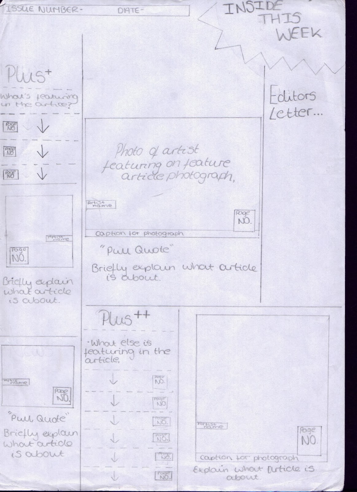
                Unlike the loud and busy vibe from the front cover, the contents page has a more relaxed feel to it which is conveyed from the straightforward layout used. The text is split into columns and sectioned off by subheadings, this organised appearance of the contents page makes it easy to read and find out which article is where. The page numbers are all in red which contrast from the white background making them stand out and the thick black border of the subheadings is an effective way of sectioning off each part making it look appealing and carrying on out this organised look.
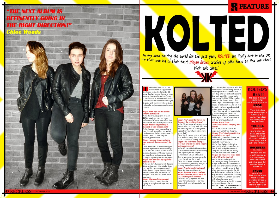
                However the contents page does carry out the same colour scheme used on the front cover; red, black, yellow and white. These colours liven up the page and make it look appealing and fun, which would relate to the young target audience of the magazine. The main picture on the contents page also relates back to the front cover as it is of the same band used on the feature article photograph. Next to the large picture of the band it also has the page number it is featuring on, this is so it is clear for the reader to know what page the main article is on. The number is in a much bigger size so it stands out and is also in white compared to the other page numbers that are in red, to exaggerate the importance of this article. The two other smaller photos on the contents page also have the bigger white page number next to it, so again people are aware of where the main articles are.
                The contents page uses a chatty mode of address to communicate with the reader and from this it’s clear that they are trying to target a younger audience. The language used on the captions of the photos are slightly colloquial, as they use words such as “bro”, this shows that they are trying to relate to the younger audience and makes it sound informal and chatty. The captions used also create a comic tone to the contents page such as “nice hair, bro” and “PLEASE DON’T STAND ON OUT CAPTIONS, KELLIN. IT’S MEAN.” these captions create light hearted humour and shows that the magazine is not serious like other rock magazines are. The contents page also addresses the reader as “folks” and “you lot!” these names come across as personal and what you what call your friends, this shows that they want the reader to see them as a friend and further supports the chatty mode of address they are using.
                This light hearted humour is also used as the editor is holding a mega phone. This ties in with the feature article photograph used on the front cover, as the member in the band Sleeping With Sirens is also holding a mega phone. This gives the impression that the he is talking through the mega phone which illustrates that even the editor is entertaining.
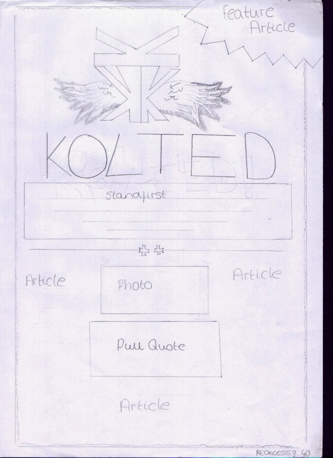
                The magazine has a running head which starts on the contents page; each heading of the page is the same as the sub heading used to section up the contents page. This makes it easy to navigate around the magazine and also makes it look uniform and professional. However the rock theme is also carried out, as not only is it black which connotes danger but it also gives the impression that it has been scratched and looks worn, this mirrors the readers care free attitude.
                The contents page also promotes the magazine by having the issue number “1484” in the top left hand corner which shows that they are a successful brand and in the right hand corner it also has information about a free gift in issue “1486”, this will persuade people to buy that edition and it also draws our attention to the fact that they have produced a large number of issues.
                In conclusion the contents page is very organised and easy to read, due to the text being separated into columns. However it still appeals to the younger target audience through the use of colloquial language used and the light hearted humour conveyed.