Music Magazine
Saturday, 8 March 2014
Friday, 28 February 2014
Target Audience & Genre
My magazine is primarily directed at teenagers between
the ages of 15-18, however it could appeal to people in their 20’s as
well. I decided to aim it at this target
audience as, being in this target audience myself I feel that I could relate to
the magazine and put my own ideas on what people of this age gap would want.
The kind of teenagers I wanted aim the magazine at was, laid back individuals
with a care free attitude and who have an interest in rock music. By not aiming
the magazine at a specific sex, it allows there to be a bigger market for the
magazine and therefore potentially increase the sales of the magazine!
When researching on what genre to base my magazine on, I
noticed that there was not many rock magazines for teenagers. As the only other magazine that has this
audience and genre is ‘KERRANG!’, therefore I thought that it would be a good
idea to use ‘KERRANG!’ for a rough guide line for my magazine. However, due to both music magazines being
the same genre and audience, I decided
to base the music on popular chart rock music.
School Magazine- EVALUATION
I feel that overall I am pleased with the
outcome of my magazine. I am particularly impressed with the masthead; the
writing is in capital letters and black font so it stands out from the vibrant
background colour I have. The typography also has the effect of it being
smudged, which ties in with the school theme of the magazine.
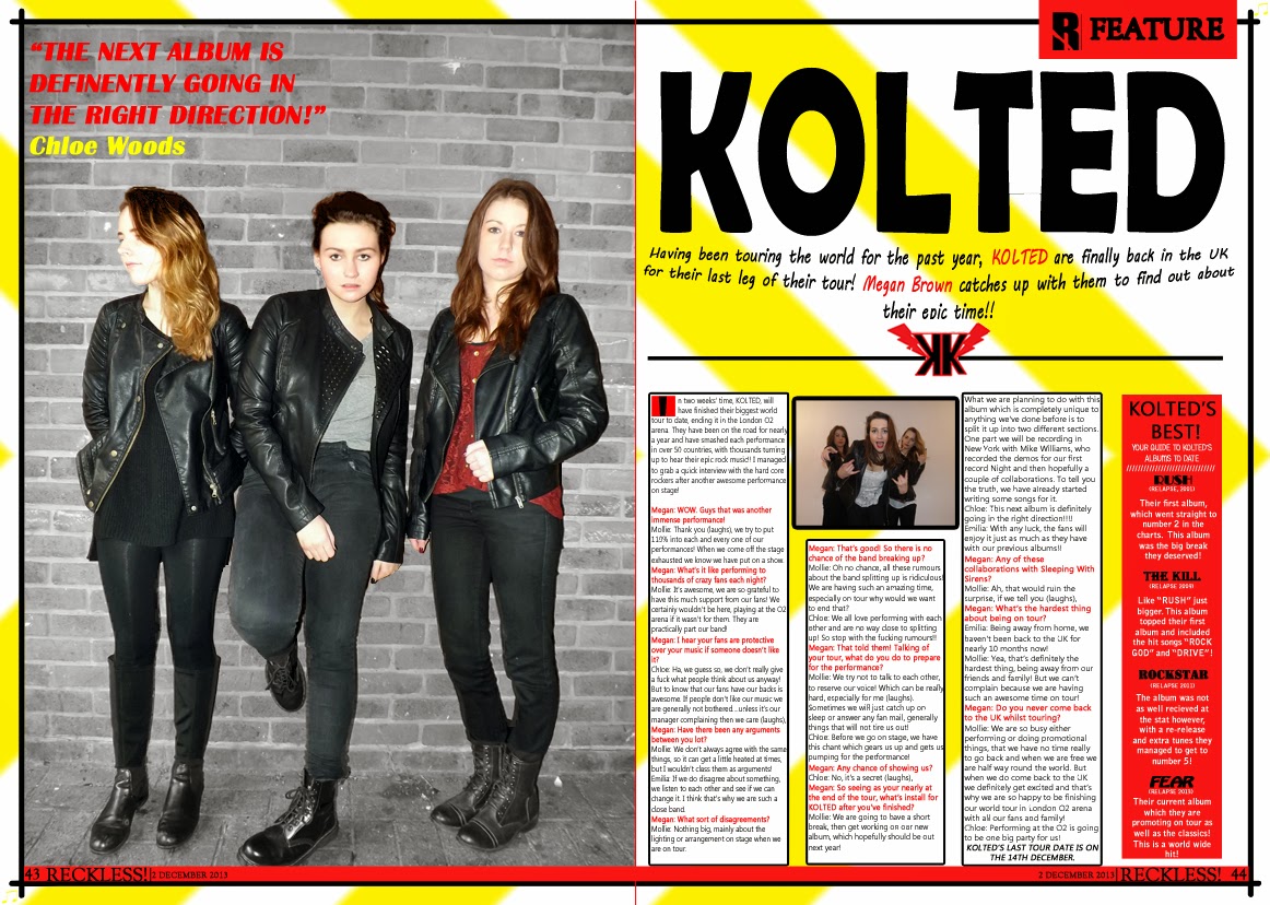
In comparison to other magazines I have looked at,
my feature article photograph is a lot smaller than the professional magazines.
Although my magazine does not show all of the person similarly like the
professional magazines, it does not fill the whole of the front page; this
means that there is a lot of negative space. Some of this negative space
however is filled with plugs and puffs such as “EXCLUSIVE INTERVIEW”. I decided
to use puffs to boost the magazine and make it look competent and eye catching,
the same way as they do on a professional magazine. Therefore some of the
negative space was used up but there is still a considerable amount left, this
is one of the things I would improve if I was to re-do the
task. Following on from this, although I was pleased with the
connotation behind my masthead, I feel that compared to the other magazines I
have looked at it is not big enough. Because of the fact that the masthead and
photograph are not big enough, this means that there is a lot of space between these
magazine conventions. When looking at the other magazines they did not have
this problem and again means that there is negative space.
Although the vibrant red background of the magazine
makes the black text stand out, many of the professional magazines tend to keep
their background plain and just use white or neutral colours. I decided to use
a red background to make it eye catching and it fits in with the school colours
used at our school. However to improve it, I could use a lighter coloured red
or change the background to white and have red text so it keeps with the school
colours but also looks professional.
On the contents page I decided to carry on the red
theme, as well as having a bold title like the masthead on the front cover. I
was pleased with the relaxed tone the page conveyed as it was quite plain but
included everything a magazine should have, without it looking overcrowded. I
was particularly pleased with the list of what the magazine featured, as it had
an extra sentence briefly explaining about that article, just like many other
professional magazines do. However the subheading of the magazine is hard to
read, so next time I would change the font to improve it.
My magazine is mostly aimed at year seven students
and other students who are new to the school. I think that this is clear from
the front cover as the feature article photograph is a picture of a young boy;
his uniform also looks smart so he represents the school in a positive way. I
feel that it is also clear to see that it is aimed at the younger years due to
the mode of address. I didn’t use any complex words and I used alliteration
“Who Will Win?” to communicate with the reader in a chatty form. My magazine is
not aimed specifically at a particular gender; because of this I used colours
that can be both female and male, so that my magazine would not be sexist. I
also have a picture of both a girl (on the contents page) and boy (on the front
page) to further emphasize that the magazine is not sexist. The demographic of
my magazine all in all represents a cheerful looking student and is aimed
mainly for pupils in younger years.
I have attracted the audience (young students) of
my magazine by the feature article photograph, from this it clear to
see that it is for the younger years and makes the magazine look welcoming and
friendly as the boy is smiling and looks buoyant. Another way in which I have
attracted the audience is by the chatty, colloquial plugs, this shows that the
magazine is not serious and tedious, which will attract more students knowing
that it looks entertaining.
Before I started this task I had no experience with
using Photoshop; however I slowly got used to the layout and different tools
that the application has to offer. Over all I found the application easy to navigate
around and use the tools to the best of my ability to construct my magazine. I
learnt how to cut around a photo using the magnetic lasso tool, this saved me a
lot of time and meant that the pictures looked neater rather than trying to use
a rubber to cut out the photo. I also found out how to edit the text to make it
look effective, I used this for my masthead to give the effect of ink being
smudged.
All in all I was generally pleased with how my
magazine turned out, however there are some improvements that I need to take
into consideration to make it look more professional.
Wednesday, 19 February 2014
Magazine Drafts-PHOTOSHOP
Magazine Drafts- PENCIL
I started off the project by drawing a basic sketch of the front cover, contents page and the double page. The written drafts aloud me to put down any ideas I had so far for the real product and meant that when it came to transferring it onto Photoshop I had a basic layout that I could work from.
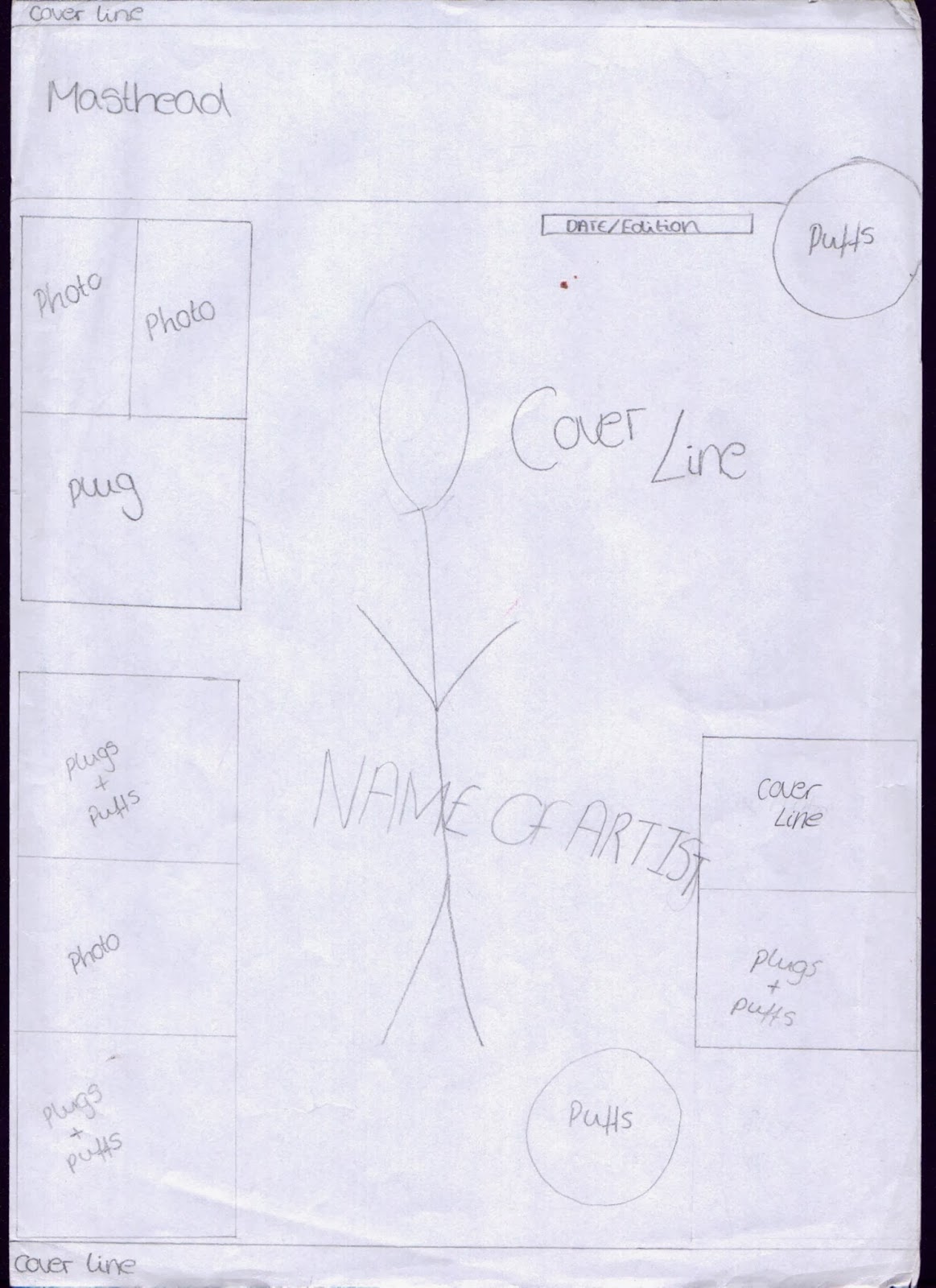 |
| FRONT COVER |
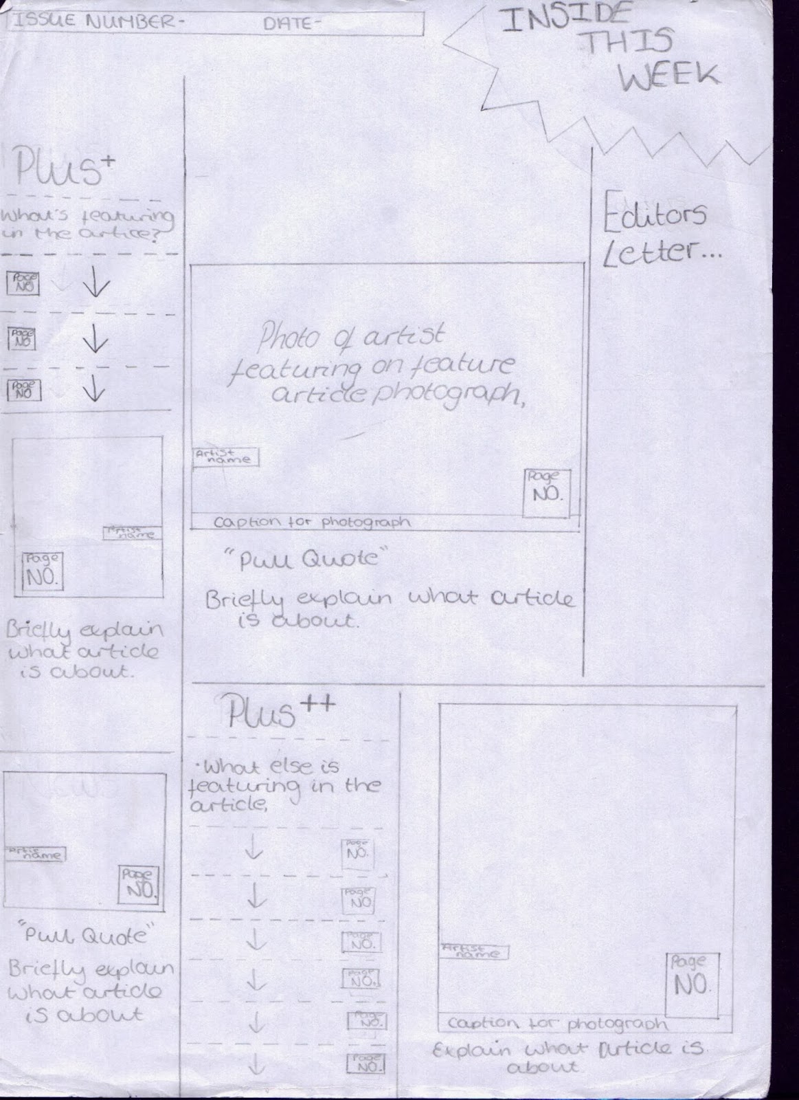 |
| CONTENTS PAGE |
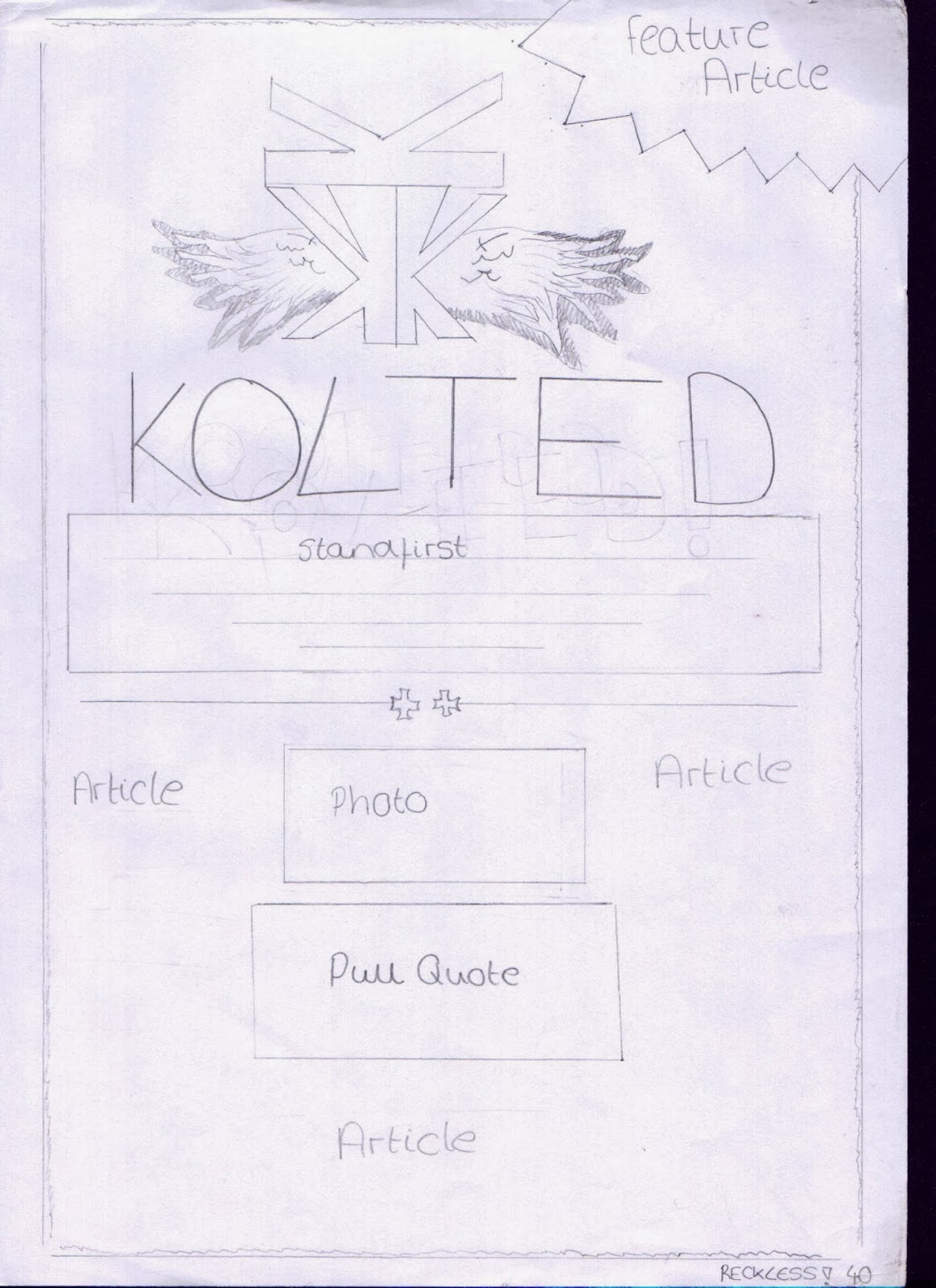 |
| DOUBLE PAGE |
 |
| DOUBLE PAGE |
Questionnaire Results Analysis
After I had gathered and tallied the results from the questionnaires, I decided to create a design brief to keep me on track when making the magazine and so that I took into consideration what my target audience wanted;
From the results collected from the questionnaires, I have found that the majority of the twenty six people I questioned preferred the red, black and white colour scheme. As a result I shall be using this colour scheme for the magazine which are also the same colours as most other rock magazines use. This suggests that my target audience may like a conventional music magazine. I am going to name my magazine ‘RECKLESS’, due to this being the most popular mast head chosen from my target audience. I also feel that it mirrors the young target audiences care free attitude. Because of the younger target audience I am appealing to and the results collected I have decided to use a light hearted comic tone, this means I will use comedy on things like the photos captions and on some of the language used for the feature article. Following on from this the mode of address will also be chatty and friendly and the language used will be colloquial so it appeals to the young audience which means that reader can relate to the magazine. Because of what I am calling my magazine; “RECKLESS”, I want to carry on this care free attitude the title conveys so I have decided to have a busy front cover. This means that the cover will contain lots of plugs and puffs as well as cover lines about what the magazine contains. Carrying on this idea of having a busy front cover, the text will be at different angles on the page; especially the puffs so they stand out and look eye catching. Lastly the text will be in different fonts to convey this chaotic vibe and will also add to the effect of a busy front cover. From looking over the results I noticed that there is a similarity to the magazine 'KERRANG', as they use a similar colour scheme to what I will be using and their magazines too create a loud and chaotic vibe, therefore I will be using this magazine for inspiration when designing my magazine.
Subscribe to:
Comments (Atom)


